How much CO2 has been emitted in my lifetime?
(To go straight to the customizable online version of the new graph, click here. But note that 1. it doesn't work that well on a phone, and 2. it is running on my own server, so it might be a bit slow. For the non-interactive, default image, see below.)
(A small discussion can be found underneath this Lemmy post).
For some years now, I have seen this graph go around on social media. I think it's a powerful image, because it shows us so clearly that it is happening in our lifetime and under our watch.
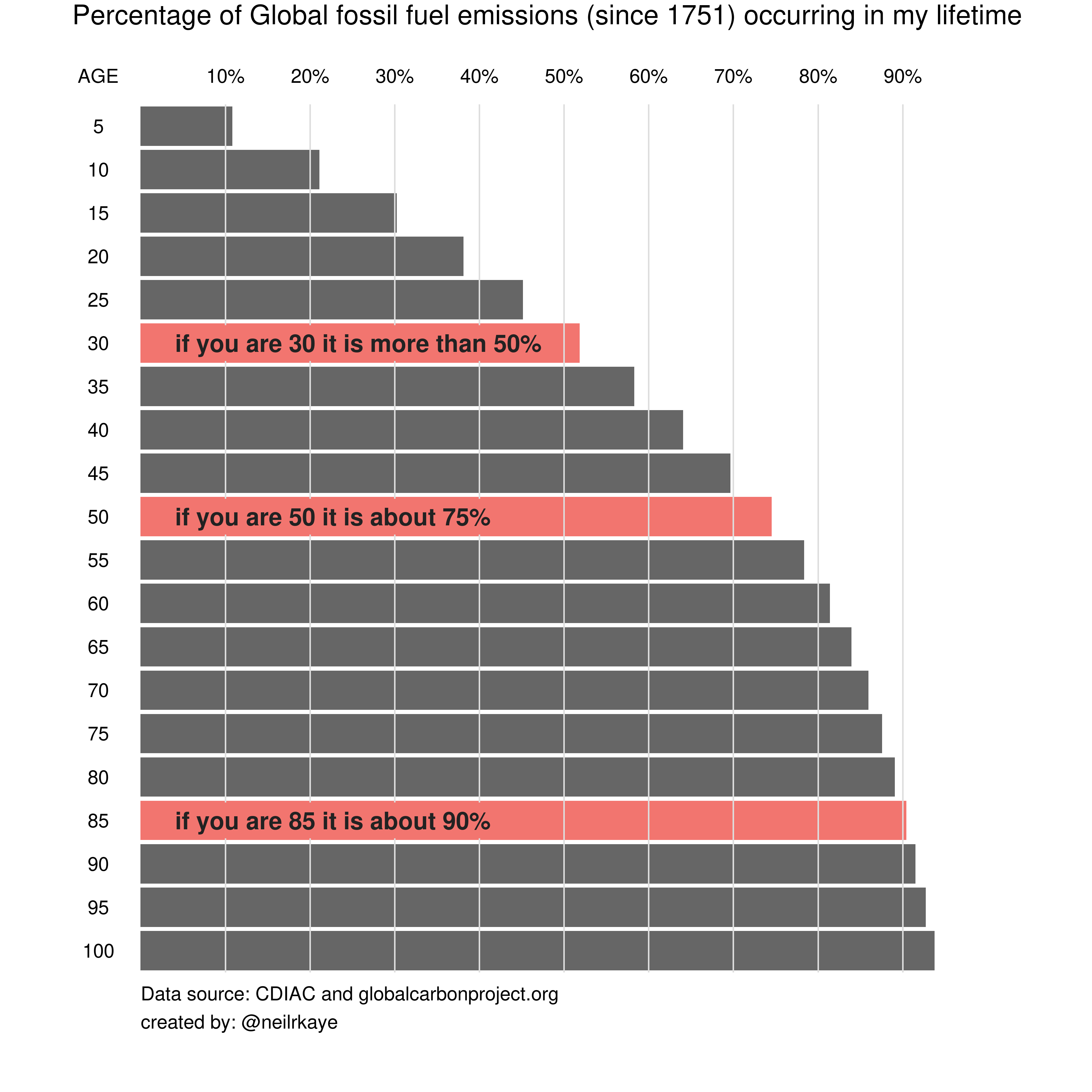
For that reason, I have also used it in some of my classes, yet always with the disclaimer the the graph does not show when it was made.
Because that is a problem: the graph might show us that if you are currently 30 years old, 50% of all the CO2 that has been emitted since 1751 has been emitted in your lifetime. But that percentage changes over time.
By now, for people who are currently 30, the percentage will be higher, simply because the annual emissions have gone up since the graph was made.
So I made a new version of this graph that is more transparent and future proof.
- First, it clearly indicates in the title when the graph was last updated. To be precise: the graph is/was only true in that year.1
- Next, I use "year of birth" on the y-axis, instead of "age". This way, you don't have to figure out how old you were in the year of the last update.
- Also, I have added a url to the graph that links to the public git repo with the code, so anyone can update the graph whenever there is more data available.
An interactive version of the graph, where you can pick your year of birth and download the personalized image, can be found here (works best on desktop): http:mishathings.org:8050
The result will kind of look like this:2
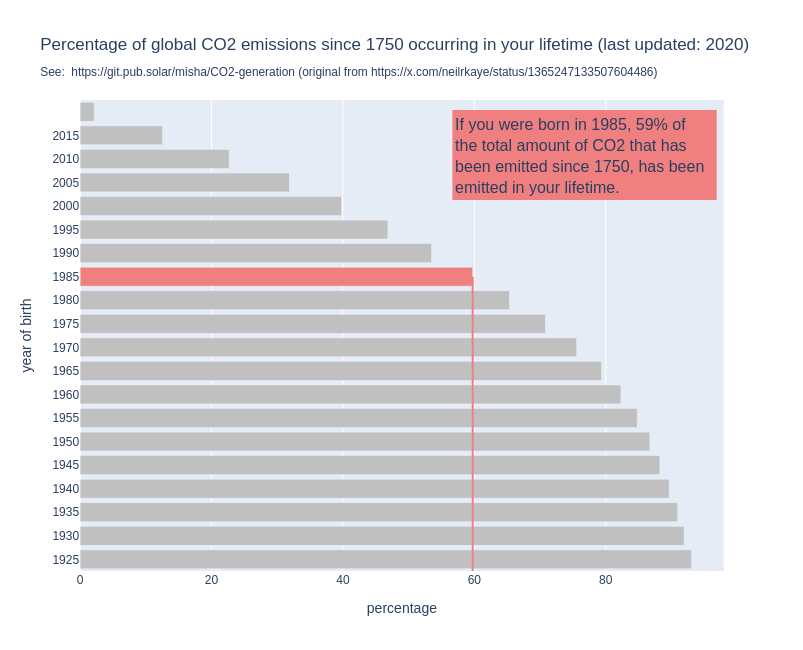
The results are not that different, which suggests that the data I am using (last update 2020), is not that different from the data used by the original graph. But at least this graph is future proof and transparent.
Now, I don't have the 17500 followers that Neil Kaye has,3 and maybe the extra add-ons make the graph a little more difficult to read (feel free to tweak, improve, fork etc.!), but I kind of hope that we will see more of this graph (and its updated version!) in the future.
And who knows, maybe at some point people will use this code, to reproduce the figure, and the top bars remain completely empty!