System Earth 2a
Atmosphere I
Misha Velthuis
m.velthuis@uva.nl
Tue 10 Sept 2024
Content
Vertical flows
Horizontal flows
Meridional flows
Zonal flows
Presentation
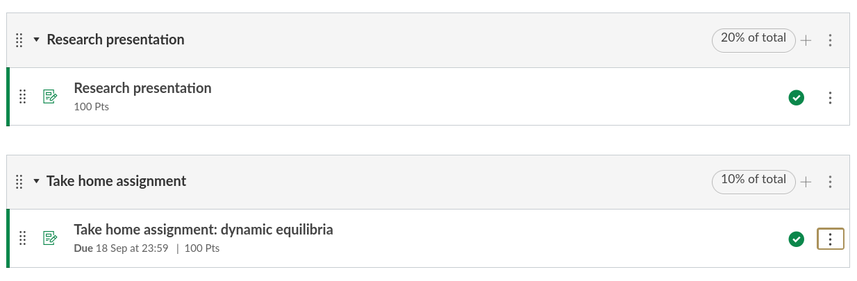
Take home assignment
Looking back
Negative and positive couplings
Negative and positive feedback loops
Dynamic equilibria
Residence time and response time
Forcings and perturbations
Feedback factor
Gaia hypothesis
Driving force
Of course …
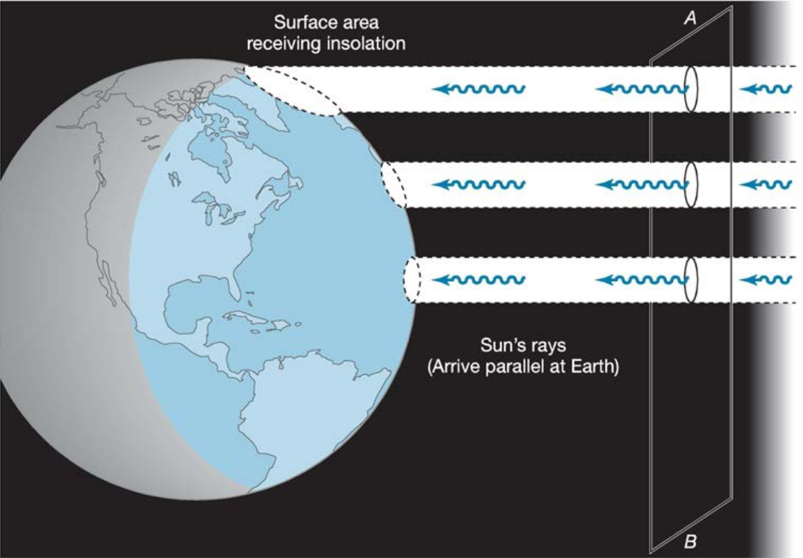
Description with image from source (NASA):
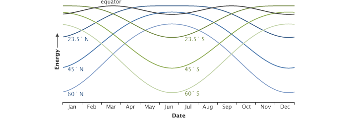
The peak energy received at different latitudes changes throughout the year. This graph shows how the solar energy received at local noon each day of the year changes with latitude. At the equator (gray line), the peak energy changes very little throughout the year. At high northern (blue lines) and southern (green) latitudes, the seasonal change is extreme. (NASA illustration by Robert Simmon.)
"Autumnal equinox"
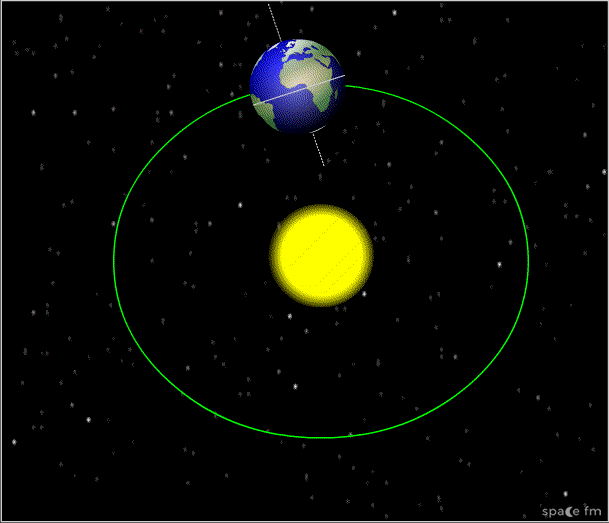
"Autumnal" equinox
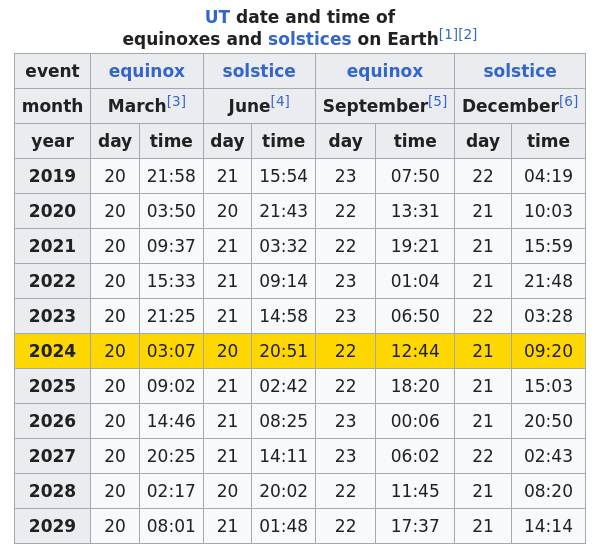
Autumnual equinox?

Autumnual equinox?
Anyway… on average …
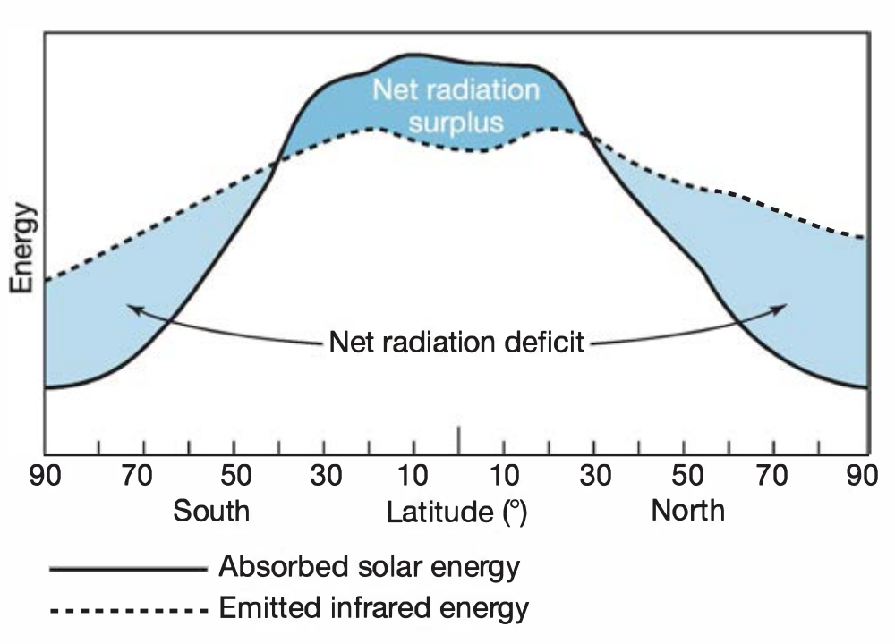
Imbalances
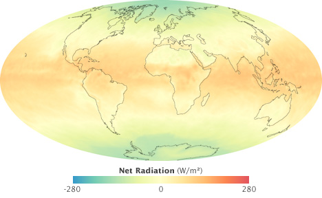
From source: (NASA):
This map of net radiation (incoming sunlight minus reflected light and outgoing heat) shows global energy imbalances in September 2008, the month of an equinox. Areas around the equator absorbed about 200 watts per square meter more on average (orange and red) than they reflected or radiated. Areas near the poles reflected and/or radiated about 200 more watts per square meter (green and blue) than they absorbed. Mid-latitudes were roughly in balance. (NASA map by Robert Simmon, based on CERES data.)
Atmospheric flows
Vertical
Buoyancy
Warm air
Lower density
Higher buoyancy
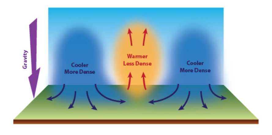
Pressure gradient
"The atmospheric pressure is a force (F)
determined by the mass (m) of the air column
and the acceleration (a) due to gravity…"
\[F = m.a\]
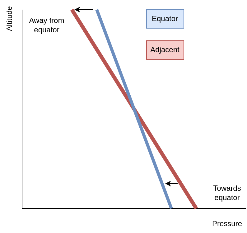
"If we consider two adjacent columns of air,
of the same volume
one warmer than the other,
the cooler column would have a greater
density, thus more mass and a higher pressure
than the warmer column."
Pressure gradient reversal
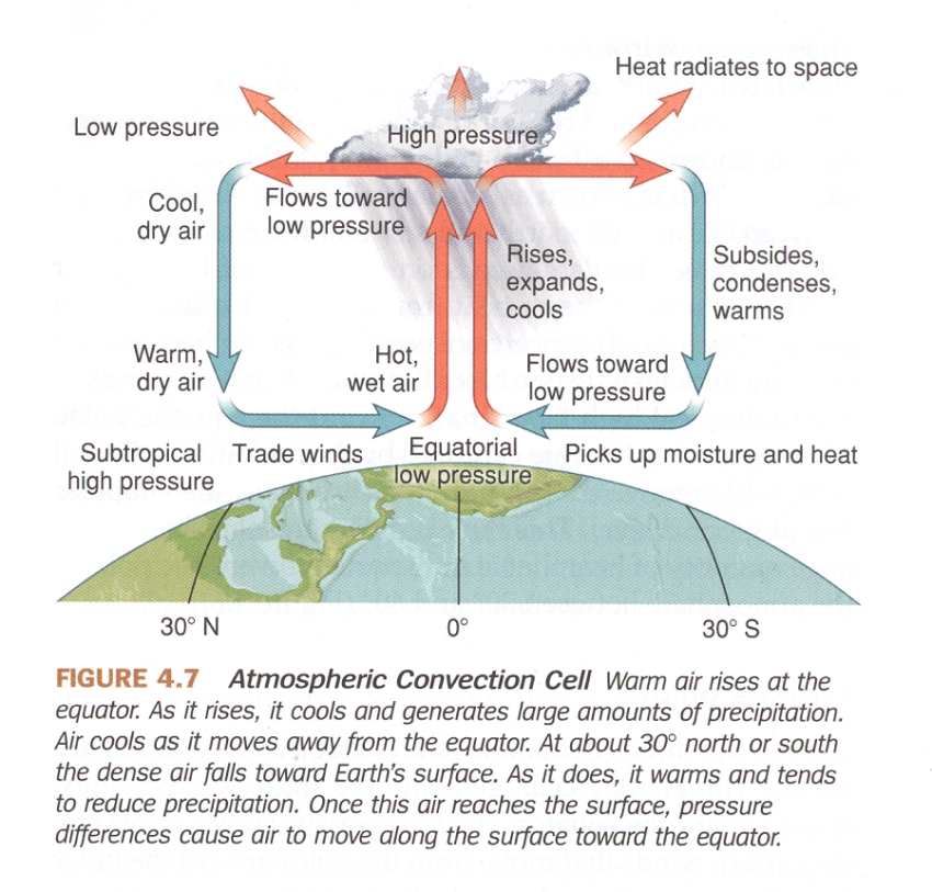
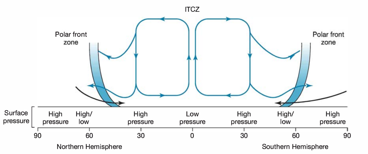
Meridional (north-south)
Some key concepts
Tropics (23.5° N/S)
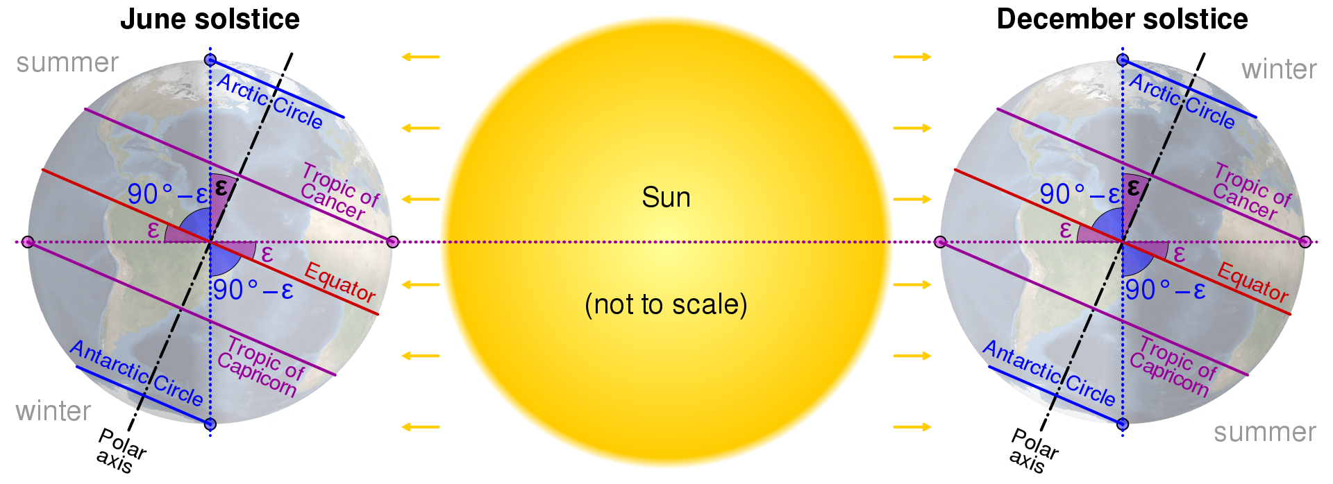
Arctic/antarctic circle (polar circle) (66° N/S)
Subtropical high (30°-35° N/S)
Midlatitudes (between subtropical high and polar circle)
High latitudes (above polar cicles)
Easterlies, westerlies, equatorward, poleward
Meridional flows
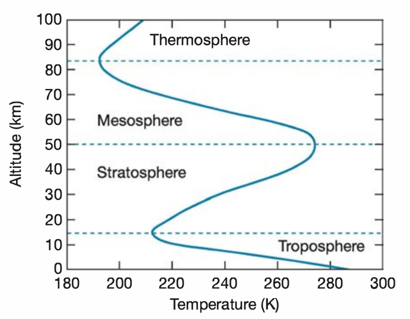
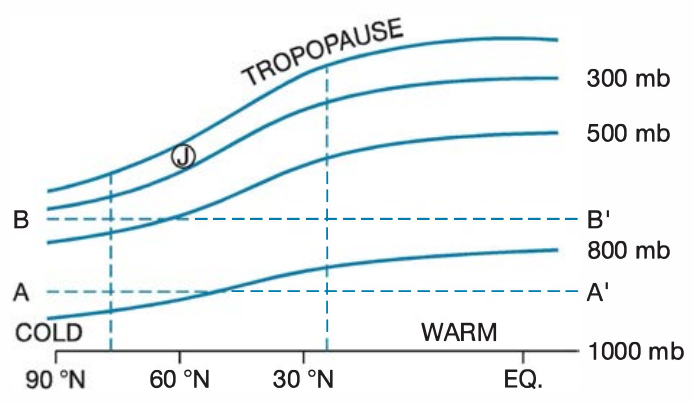
Temperature vs altitude
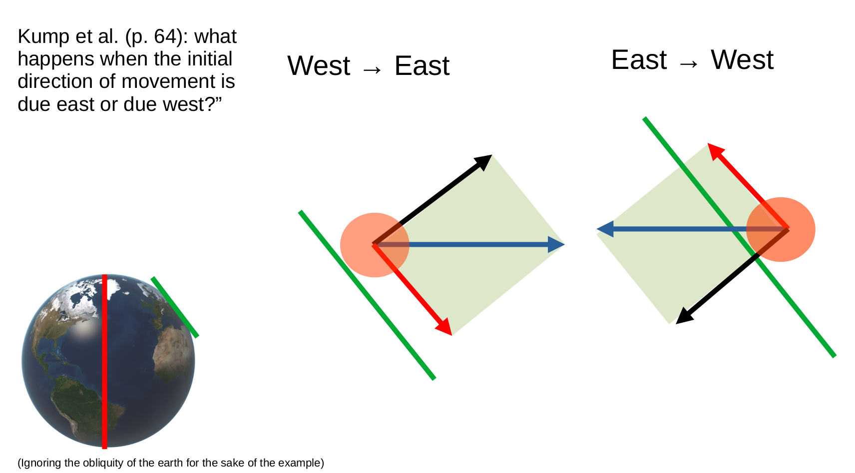
Zonal (west-east)
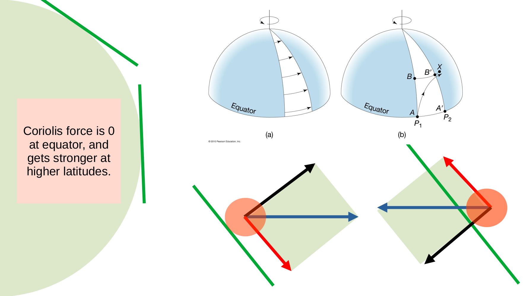
Coriolis force
Coriolis effect on north-south flows
Coriolis effect on west-east flows
Jet stream
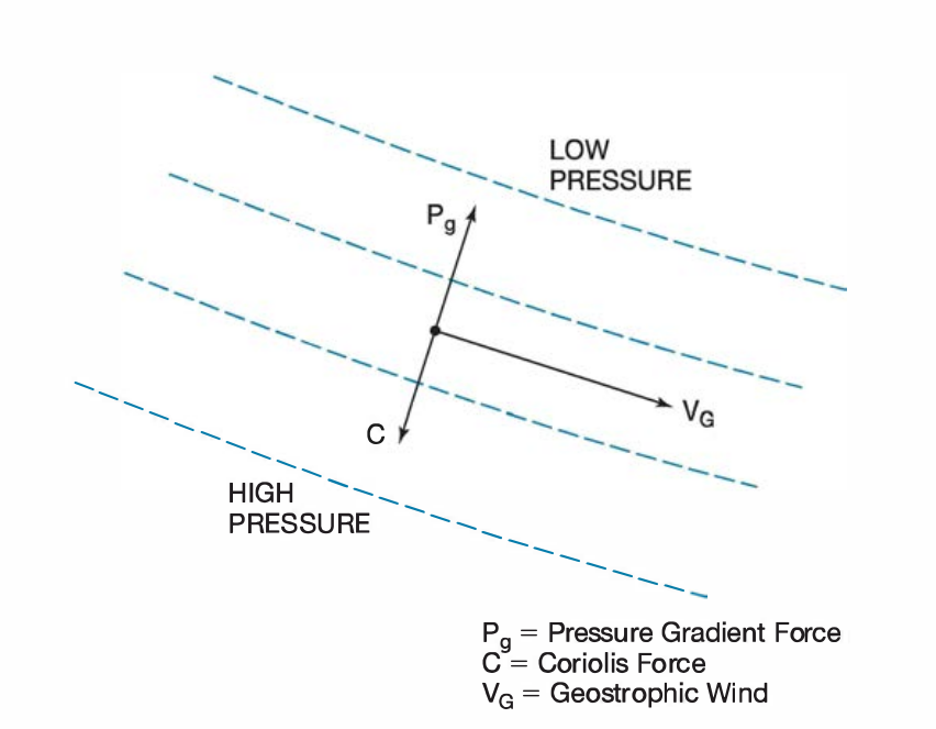
Geostrophic wind
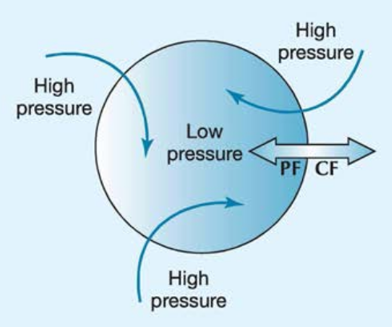
Weather in midlatitudes
Summary
Vertical flows
Horizontal flows
Meridional flows
Zonal flows