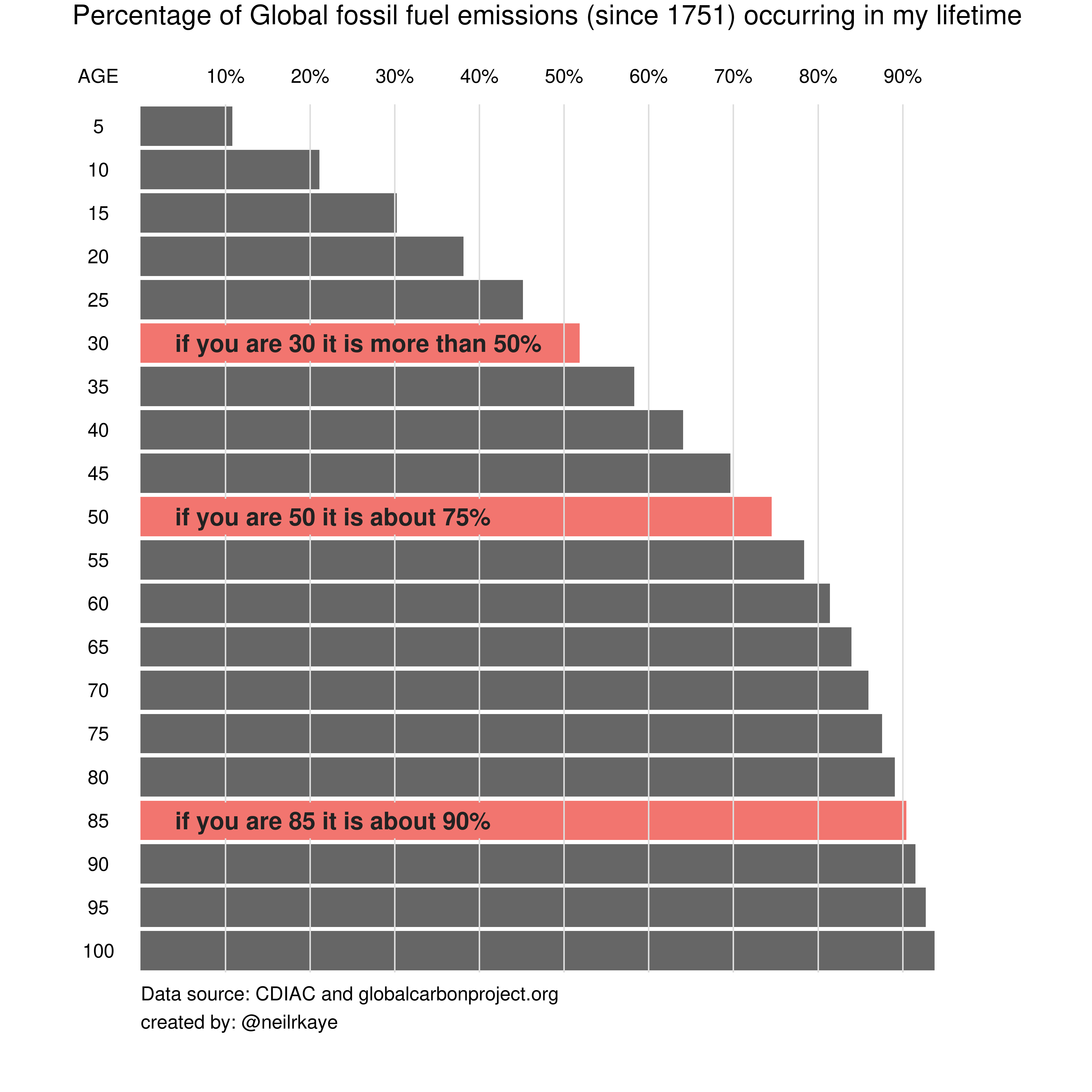
The problem
The original graph shows the ratio of the "increase in the total emissions over the last x years" divided by "the total emitted emissions".
To be more precise, it shows this ratio for different values of this x: the last 30 years, the last 50 years, the last 85 years, etc.
My question is: how do these ratios differ over time. As in, the graph was probably made somewhere in the late 2010s; how would you expect these percentages to change when you remake the graph in the present?
The reason why I am asking this question is because I invested quite a bit of time in developing an "updated version" of the graph, assuming that the ratios do change over time. But I never really critically examined that assumption.
Spoiler alert: as long as the emissions per year keep growing with a steady annual growth rate, the percentages in the original graph are most likely going to be surprisingly future proof.
Does this mean that updated graph is useless?
That all depends on our ability to bring down the annual growth rate of the emissions (hopefully to big negative numbers).
Some calculus
Ok, so let's start with some math. My calculus is shaky, but I think the question can be reduced to the squiggly lines below, where ...
Sis the total amount of emissionsdS/dtis the increase ofSover timeris the rate at whichdS/dtgrows over timetis timeCis the starting quantity of S.
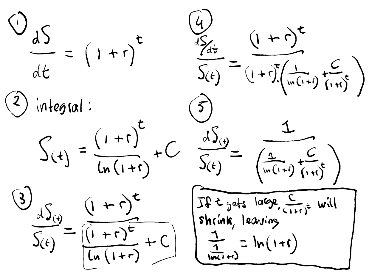
This suggests that in the long run (at large values of t), the ratio of (dS/dt)/(S) will gravitate to ln(1+r).
Which in turn suggests that the fractions shown in the original graph (50% for 30-year olds, 75% for 50-year olds) should stabilize over time (as long as the emissions keep growing at the same rate).
Given the shakiness of my calculus, it would really boost my confidence in these results if I can replicate it numerically. So let's do some Python.
#------- Numerical solution ----------

import math
import matplotlib.pyplot as plt

r = 0.1
C = 4
S = C
S_collect = []
t_collect = []
ratio_collect = []

for t in range(100):
    dS = (1+r)**t
    S = S + dS
    S_collect.append(S)
    t_collect.append(t)
    ratio_collect.append(dS/S)

#------- Analytical solution ----------

ratio2_collect = []
for t in range(100):
    ratio2 = (1/((1/math.log(1+r)) + (C/((1+r)**t))))
    ratio2_collect.append(ratio2)

plt.clf()
plt.plot(t_collect,ratio_collect)
plt.plot(t_collect,ratio2_collect)
plt.xlabel('t')
plt.ylabel('S')
plt.grid(True)
plt.ylim(0.08, 0.12)
plt.show()

This is dissatisfying. It does not fit.
Attempt 2 (successful)
But then I realized that r means something else in the numerical and analytical solution.
In the numerical solution it means that dS/dt in one particular year is equal to its own value of the previous year, times 1.1.
The analytical solution written out above uses the compound growth rate, which means that the change of dS/dt - at any point in time - is 1.1 times it's own value at that time.
To numerically verify the analytical solution, I will have to use an annual growth rate for dS/dt that corresponds with a compound growth rate of 0.1.
The beauty of Euler's e
If the speed at which something grows - at any point in time - is equal to its size, in one timestep, it grows with a factor e (euler's e))). (Which I feel makes Euler's one of the most amazing constants, up there with pi).
Put differently, if dS/dt = S then S(t) = e^t + C.
If the speed at which something grows - at any point in time - is equal to 10% of it's size, in one timestep it will grow with a factor e^0.1.
Put differently, if dS/dt = 0.1*S then S(t) = e^(0.1*t) + C.
Here it becomes important to recognize that in our case we are not talking about the rate at which S grows, but the rate at which dS/dt grows!
It is not that the total amount of emissions that has a compound growth rate of 10%, but the annual increase of the emissions!
So to find out the fraction at which the total amount of emissions grows (dS/dt) in any year we use:
dS/dt = e^(0.1*t)
In other words: a compound growth rate of 0.1 leads to an annual growth rate of about e^(0.1*t).
Indeed, using this new "annual growth rate", the numerical and the analytical solutions match.
(I presume the fact that they don't match perfectly is due to the inaccuracies of numerical modelling).
#------- Numerical solution ----------

import math
import matplotlib.pyplot as plt

r = 0.1
C = 4
S = C
S_collect = []
t_collect = []
ratio_collect = []

for t in range(100):
    dS = math.e**(0.1*t)
    S = S + dS
    S_collect.append(S)
    t_collect.append(t)
    ratio = dS/S
    ratio_collect.append(ratio)

#------- Analytical solution ----------

ratio2_collect = []
for t in range(100):
    ratio2 = (1/((1/math.log(1+r)) + (C/((1+r)**t))))
    ratio2_collect.append(ratio2)

print(ratio, ratio2)
plt.clf()
plt.plot(t_collect,ratio_collect)
plt.plot(t_collect,ratio2_collect)
plt.xlabel('t')
plt.ylabel('S')
plt.grid(True)
plt.ylim(0.08, 0.12)
plt.show()
0.0951650848933809 0.09530727946025028

So far, we have corroborated the analytical solution written out above.
I wrote:
"This suggests that in the long run (at large values of t), the ratio of (dS/dt)/(S) will gravitate to ln(1+r)."
And indeed: at large values of t the ratio of (dS/dt)/(S) does indeed gravitate to ln(1+r), which in this case is 0.09531.
math.log(1+0.1)
0.09531017980432493
Looks like my calculus was not too shaky.
Adding ages
So far we have not really considered the role of different periods of change.
Put in the language of the original graph, we have not really considered the role of ages.
Put analytically, how does the ratio of (dS/dt)/(S) differ for different values of dt?
From here onwards, given the shakiness of my calculus, I will stick to the numerical path:
import math
import matplotlib.pyplot as plt

graph_collect = []
ages = [1,10,20]
for age in ages:
  r = 0.1
  C = 1
  S = C
  S_collect = []
  t_collect = []
  ratio_collect = []
  collect_x_year_olds = []
  ratio_collect_x_year_olds = []
  for t in range(100):
      dS = math.e**(0.1*t)
      S = S + dS
      t_collect.append(t)
      if len(collect_x_year_olds) < age:
          collect_x_year_olds.append(dS)
          ratio_collect_x_year_olds.append(0)
      elif len(collect_x_year_olds) == age:
          collect_x_year_olds = collect_x_year_olds[1:]
          collect_x_year_olds.append(dS)
          ratio_x_years_olds = sum(collect_x_year_olds)/S
          ratio_collect_x_year_olds.append(ratio_x_years_olds)
  graph_collect.append(ratio_collect_x_year_olds)

  print(f"The percentage for {age} year olds will gravitate to {round(ratio_x_years_olds,5)}%.")

plt.clf()
for i in graph_collect:
  plt.plot(t_collect,i)
plt.xlabel('t')
plt.ylabel('S')
plt.grid(True)
plt.show()
The percentage for 1 year olds will gravitate to 0.09517%.
The percentage for 10 year olds will gravitate to 0.63215%.
The percentage for 20 year olds will gravitate to 0.8647%.

This suggests that in the long run, for a system with a steady r of 0.1, the increase of S overseen in the life of 1-year olds is (as we saw before) will always be 9.5% of total emissions, the increase overseen by 10-year olds will always be about 60.3%, and the increase of S overseen in the life of 20-year olds will always be 86.5%.
Back to the original graph
Let's apply these lessons to the actual graph by adding some realistic numbers.
According to this graph, the cumulative CO2 emissions in 1960 were 308 GT, and 1800 GT in 2023.
#308*(1+r)**63 = 1800
#(1+r)**63 = 1800/308
print((1800/308)**(1/63))
1.028419226152095
That leaves us with an average annual growth rate of 2.84%.
(In reality the annual growth rate fluctuates quite a bit, but there is no clear trend, so taking an average of 2.84 seems reasonable to me).
So let's see what happens if we add these numbers to the script for different ages.
import math
import matplotlib.pyplot as plt

ages = [30,50,85]
for age in ages:
  discrete_r = 0.0284 # annual growth rate, not compound growth rate
  C = 380
  S = C
  t_collect = []
  collect_x_year_olds = []
  for t in range(1000):
      dS = (1+discrete_r)**t
      S = S + dS
      t_collect.append(t)
      if len(collect_x_year_olds) < age:
          collect_x_year_olds.append(dS)
      elif len(collect_x_year_olds) == age:
          collect_x_year_olds = collect_x_year_olds[1:]
          collect_x_year_olds.append(dS)
          ratio_x_years_olds = sum(collect_x_year_olds)/S

  print(f"The percentage for {age} year olds will gravitate to {round(ratio_x_years_olds,2)}%.")
The percentage for 30 year olds will gravitate to 0.57%.
The percentage for 50 year olds will gravitate to 0.75%.
The percentage for 85 year olds will gravitate to 0.91%.
As it turns out, these percentages fit suprisingly well with the percentages shown in the original graph (see below).
In other words, the percentages in the original graph are very close to the percentages you would expect any system to gravitate to, when the annual increase grows with 2.84% per year.
That means that, as long as the CO2 emissions keep rising with the same average annual growth rate, the original graph is actually surprisingly "future proof".
All of this provides an (extra?) explanation for the fact that the percentages of my new, updated graph are quite similar to the ones of the original graph, despite the fact that the latter is probably five years older:
- People who were 85 in 2023, and were thus born in 1938 get a percentage of 90% (vs "about 90%" in the original graph).
- People who were 50 in 2023, and were thus born in 1973 get a percentage of 73% (vs "about 75% in the original graph)
- People who were 30 in 2023, and were thus born in 1993 get a percentage of 51% (vs "about 50% in the original graph)
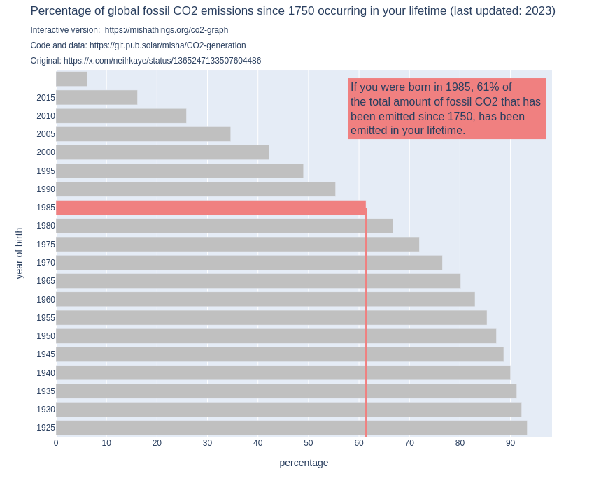
What does this mean for my graph?
Does that mean my fancy interactive updated graph is useless?
Firstly, not if you care for data transparency!
Secondly, that depends on you! And me. And everyone else. If we manage to break the system that causes the annual CO_2 emissions to steadily increase with 2.84%, my graph might just as well come in handy!